
ALERT for forScore users: The interface has changed, and you need to look at it before your next rehearsal or concert.
forScore is one of my favorite apps of all time. I’ve been using it for something like 8 years, and it’s really the only reason that I have an iPad Pro (the one with the biggest screen).
A couple of days ago, Hazel mentioned to me that forScore interface on her iPad had changed, suddenly and significantly. Since then, I’ve seen the same thing on my iPad.
Here’s what is happening. Apple has just released iPadOS 26, and this release includes major interface changes. In particular, there are changes related to menus, multitasking, and windowing. The forScore developer has always been great about keeping up iPad changes, and this release has been no different. forScore version 15 was released at roughly the same time as iPadOS 26.
If you have automatic app updates enabled on your iPad, as Hazel and I do, then you may get the new forScore version, with its interface changes, without warning. I recommend that you look it over and familiarize yourself with the basic changes before you next need to use it in a rehearsal or concert.
I have a few examples and screenshots below, but I recommend that you explore the forScore version 15 documentation. (Kudos to the developer for always having complete documentation ready to go with the releases.) In particular, look at the sections about menus, scores, bookmarks, setlists, contextual menus, and windows.
The forScore interface changes are motivated by Apple’s new iPad interface concepts, including windowing and menus. Having multiple forScore windows, and being able to switch easily between them, is something I can definitely imagine adopting in my own usage. These changes will take some adjustment, and that may be annoying in the short term, but it will be worth it.
An important new concept is that iPad apps can have a menu bar at the top of the screen. This can be accessed by swiping down a bit from the top of the screen. Note that the menu bar includes window controls at the left. You may find other common actions located in different places. Look for them at the upper left, upper right, and bottom left. You can also try long-press on items, such as scores in a score list, to get a contextual menu.
Here are some screenshots to get you started.
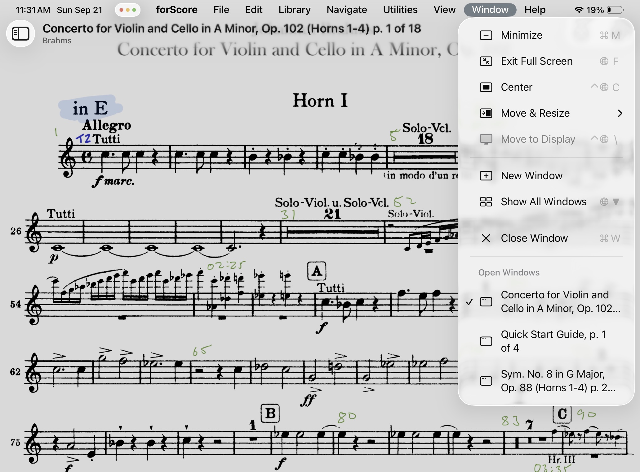
Menu bar with Window menu selected; current windows listed
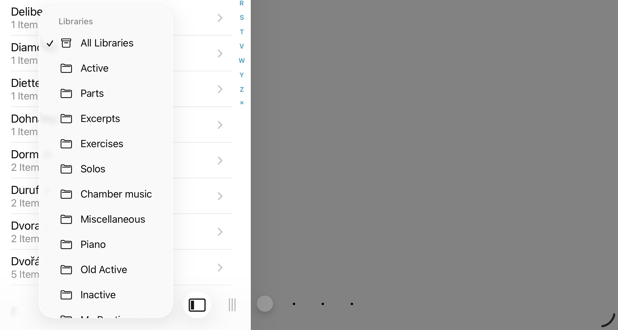
Library list popup menu, bottom left
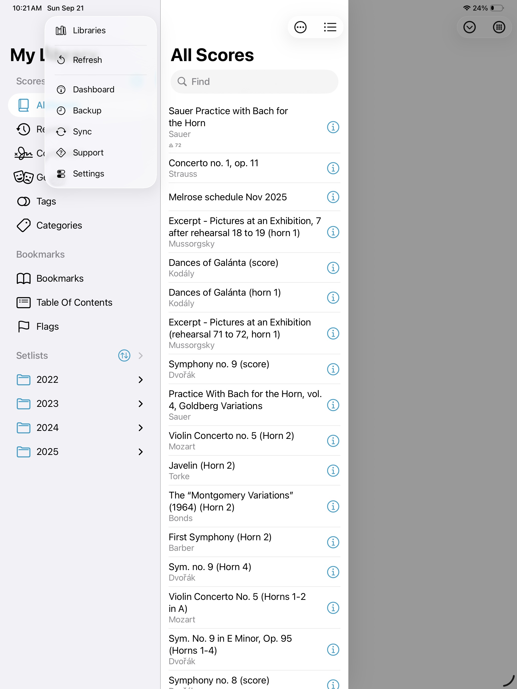
“All Scores” list, popup menu, access to score sorting options, bookmarks, and settings all in one combined view